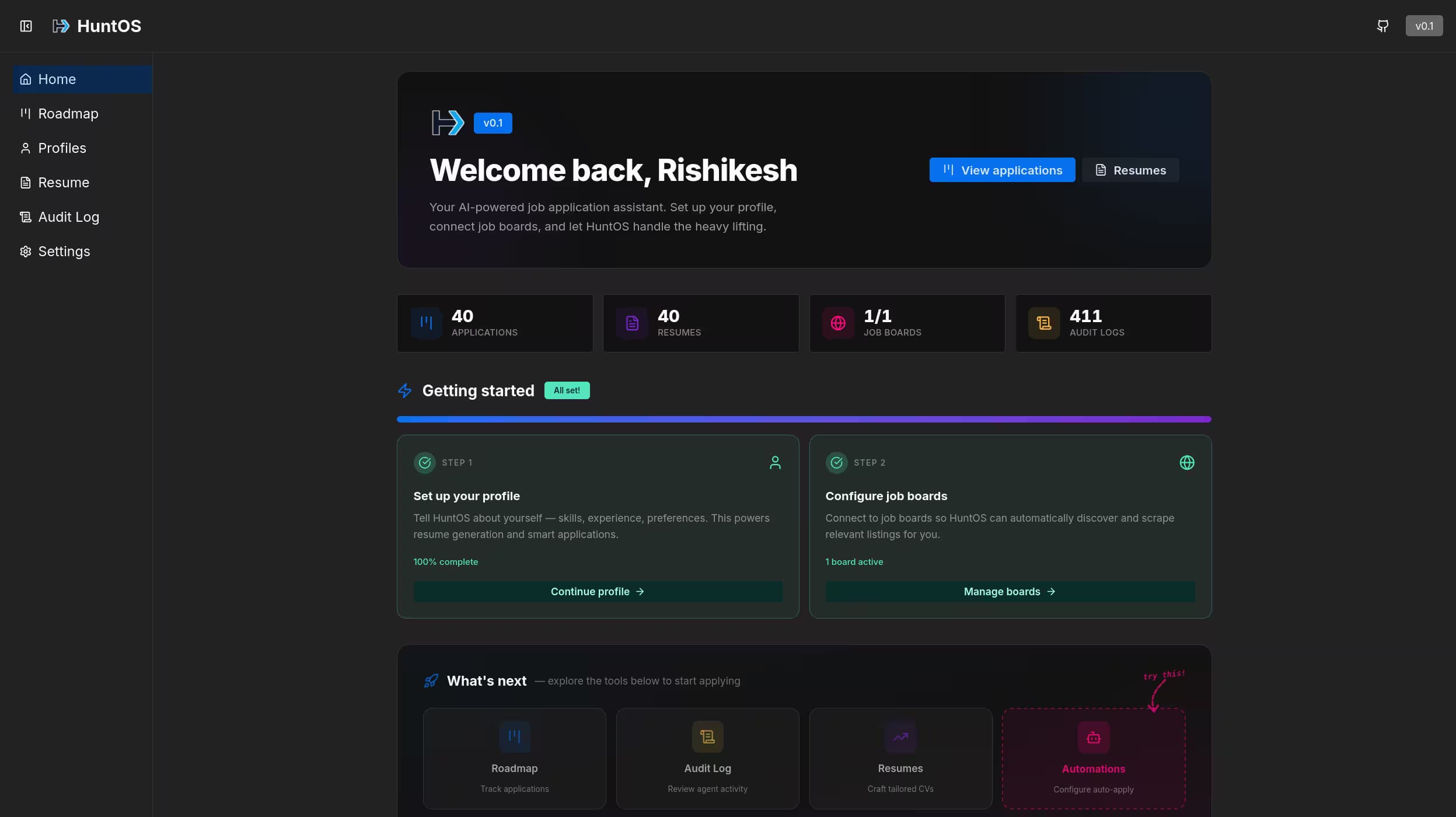
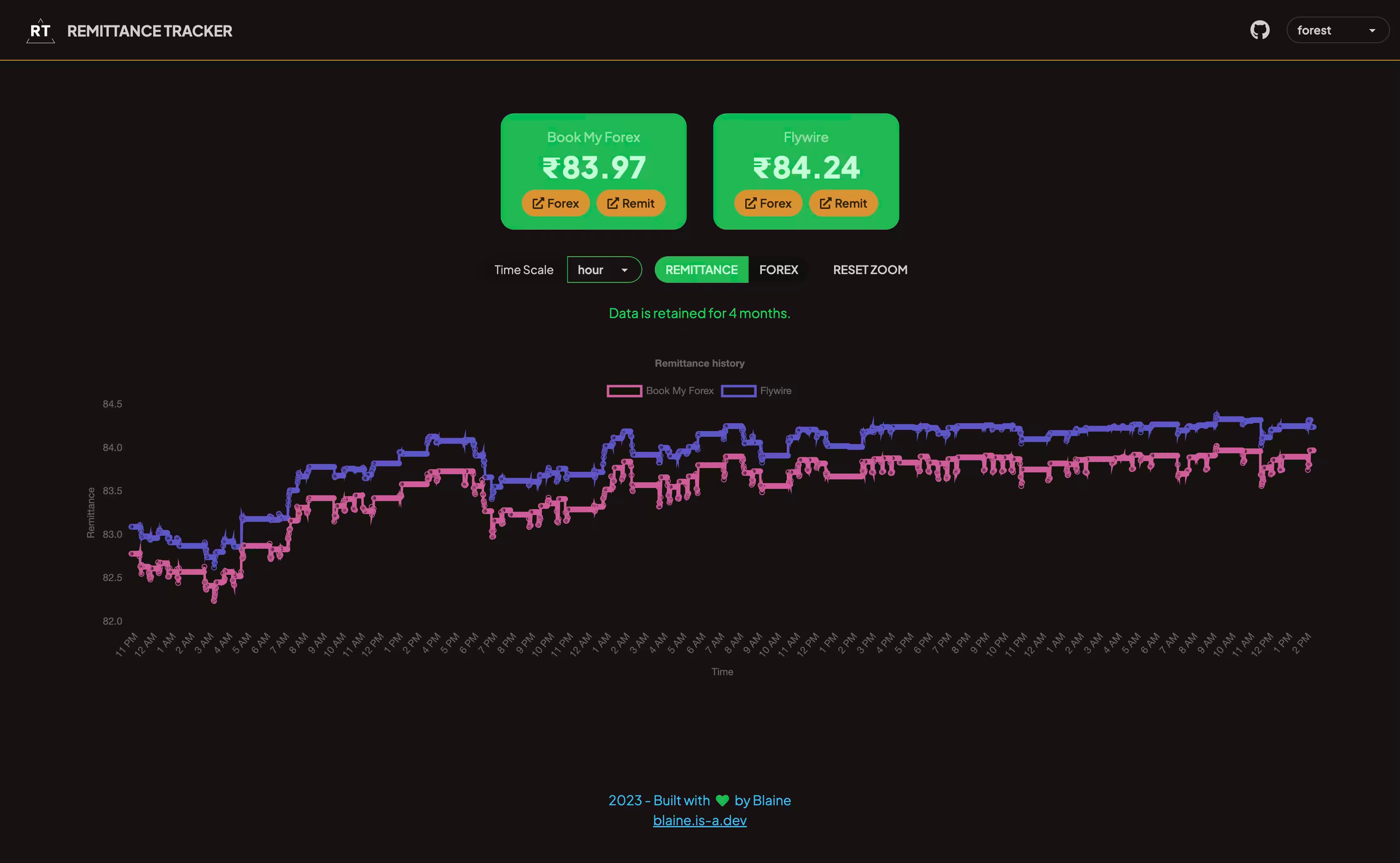
2023
New portfolio
Inspiration and Design
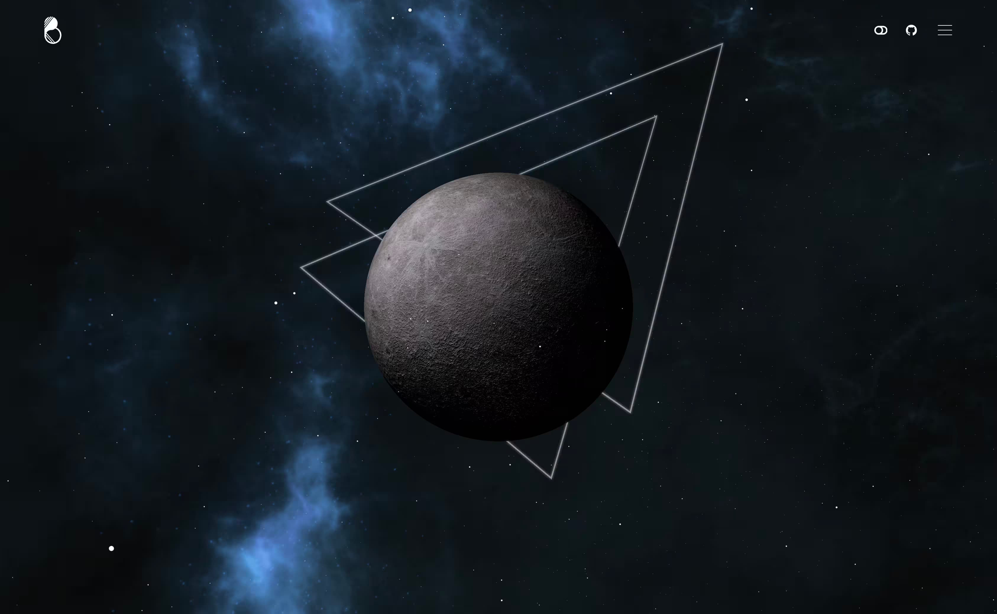
Learning from the mistakes I made in my old-portfolio, I started working on a new one. I had the opportunity to talk to alot of students in the UX department at Arizona State University and I also wanted to resolve the deep rooted navigational challenges. Even worse fireship had made a video on how to render a moon using ThreeJS. Which meant that my portfolio design was not unique anymore.
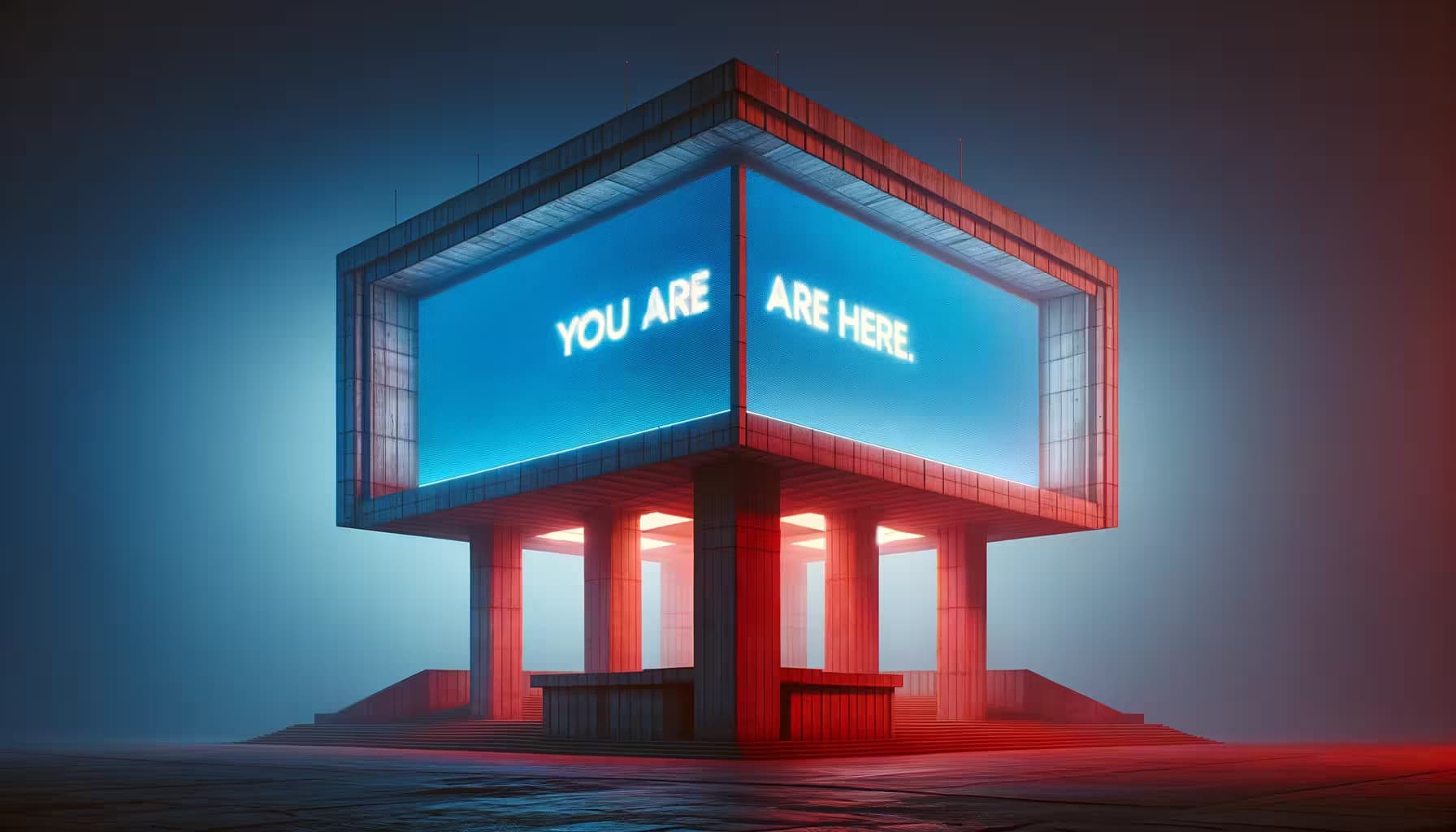
Starfield came out around the time I was working on the portfolio and as such the site went through a complete overhaul. The initial design was pretty much inspired by the design choices used in the game. However, moving forward I switched to a more brutalism inspired tone. The Sky Grew Darker by Tomasz Artur Bolek was the driver for the chosen color palette. I dropped the idea of including a 3d scene, and instead switched focus to working on the one you see. Heck I even made Rain postprocess filter for ThreeJS based on shaders written by Lucas Bebber in their article on CoDrops. I wish I can find a use case for it some other time.
Implementation
I dropped Astro, even though its great I really wanted to implement simple page navigations. I switched to SvelteKit, although in hindsight since I picked up the new transitions api for page transitions, I doubt the switch gave me actual benefits apart from some small cases of site interactivity. Maybe I might migrate to Astro again in the future. Learning Svelte and SvelteKit was a breeze, and I really enjoyed working with it (Thanks JoyOfCode!). I also used TailwindCSS for styling, moving away from much of the custom styles on my old website.
Fun Facts
- Most of the images on the site were made when the work on the page was finished (even after I wrote this line, fingers crossed).
- I used placeholder images from http.dog for the thumbnails, particularly the 204 image.
- The backdrop went through several iterations, and at one time featured a noise texture similar to the one used in Arc.net.
